
Websites are becoming more and more complex. Adding more content and features to our sites makes them more complicated. Humans have limited capacity for processing information. If we were shown all the information or features of a product all at once, we’d get overwhelmed.
Removing content seems like an obvious solution for this problem. But in many cases removing the content is not an option. The content is there for a reason in the first place. So we need to find a different way to solve this problem.
We can prioritize content by hiding content from users until they ask or need to see them. By removing the distractions we can simplify the baseline experience. By hiding secondary content and features, you remove clutter in the user interface and simplify its appearance. This way we maintain focus and help users to form a better understanding of your message.
This is progressive disclosure.
In this article, we’ll look at common uses of progressive disclosure. We will show you how to use revealing interfaces in your designs. And how to remove distractions and help users to focus their attention.
What is progressive disclosure?
Progressive disclosure is a technique in which more information is slowly revealed to the user. It prevents overwhelming the users with information by guiding them through the content.
The technique is used in several disciplines from classroom teaching to user interface design.
In simple words, progressive disclosure is about offering a good ‘teaser’ for the content that you want to present. A teaser can include the following.
- A sample of what is next
- An introductory task that is most common
- A high level overview of what is expected
- A wizard that walks you through the task (staged disclosure)
- A button that leads to more advanced functions.
9 examples of how progressive disclosure is used in interaction design?
It’s a tough decision to defer most of the information to secondary screens because many users will never see it, even though you no doubt consider it very important. Especially mobile devices require a tight focus in content presentation, with the first screen limited to only the most essential information.
Progressive disclosure can take many shapes. Below, we look at 10 examples of progressive disclosure in websites.
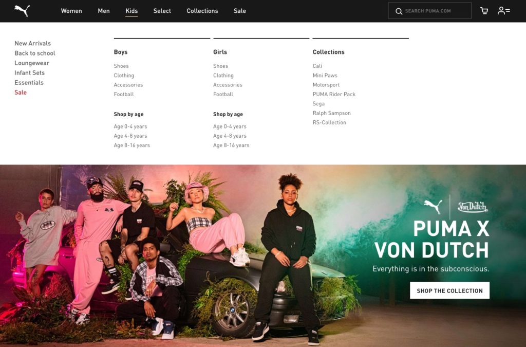
1. Dropdown menu
The most common example of presenting information in steps. Showing a navigation with presenting extra information when the user moves over (or clicks) the main navigation item revealing a sub navigation.
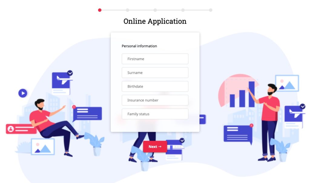
2. Multi Step
Presenting a large signup form in multiple steps (staged disclosure). By disclosing information staged, we reveal only the essentials, and help users manage the complexity of the information. Once the information is understood (or completed) they can move on to the next bit of information..
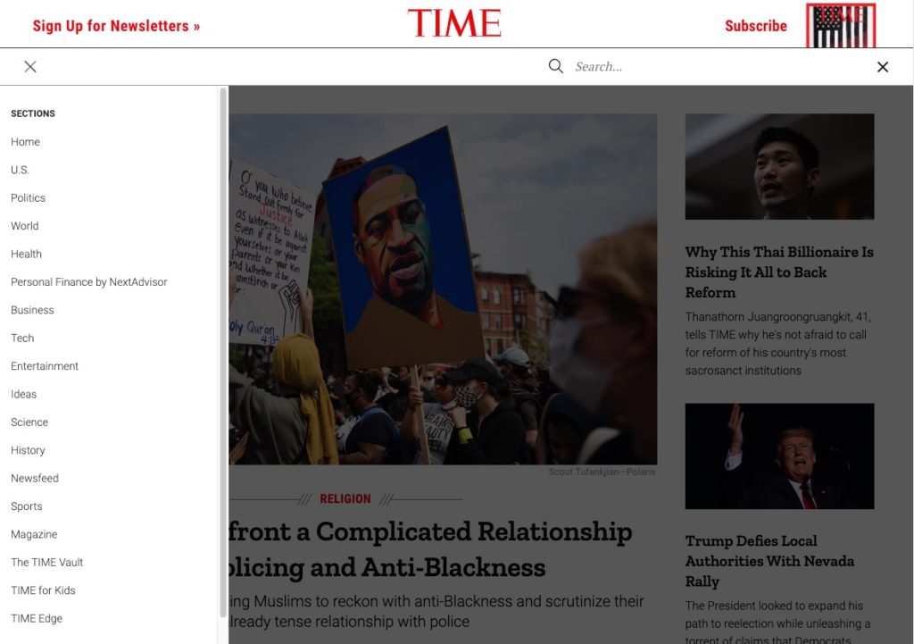
3. Off canvas navigation
In small screens when the space to present information is limited. We can hide information to clean up the interface. A good example is the off canvas menu in mobile phones. By revealing the navigation only when an icon is pressed we help the user to focus on the information that is presented on the screen.
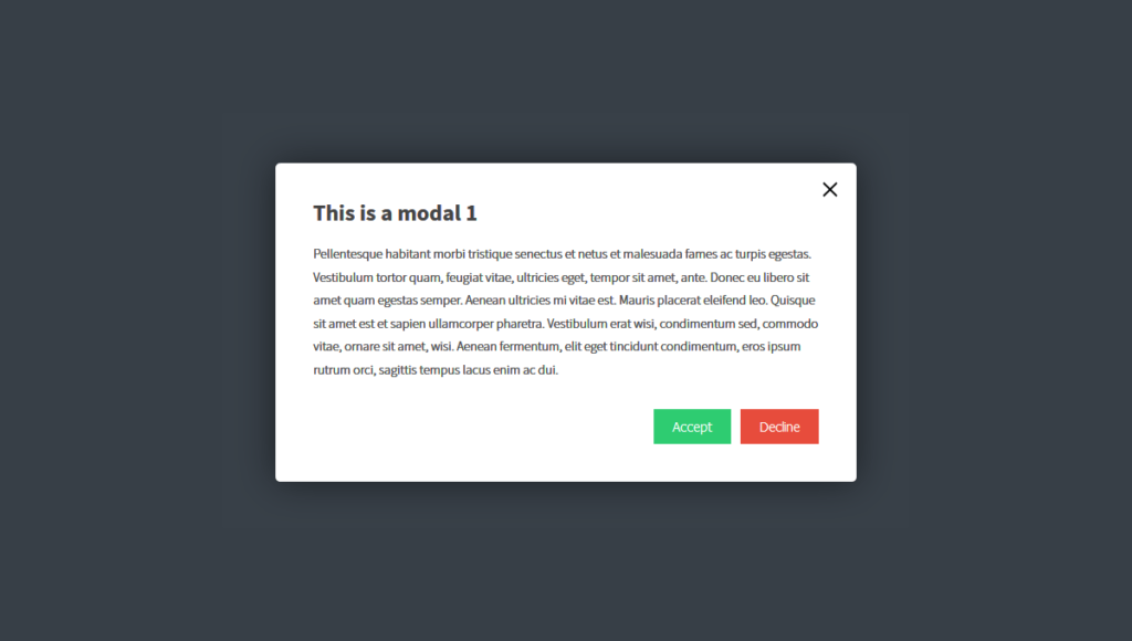
4. Modal layover
In situations where the user needs to focus on one specific action we can help them by presenting the information in a modal layover. With this technique the user only needs to focus on the information that is presented in the panel.
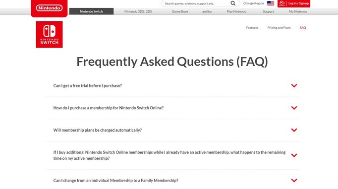
5. Collapse or Accordion
Collapsing panels are often used for FAQ sections, helping the user to scan the questions that are usually grouped in sections. By clicking a question the answer is revealed.
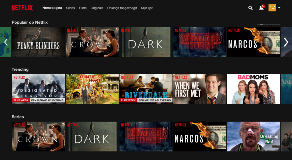
6. Content previews and Filter page
Content previews are typical examples of progressive disclosure. A snippet (card) is used the provide the user with just enough information to help them decide if they want to dive deeper and read the full content.
This technique is commonly used on content heavy websites and blogs. Websites show visitors an overview of articles up front, and lets the user decide which ones they want to actually open up and read.
Also by using filters we can help the user to browse through the content by hiding what they don’t need.

As interface complexity problems change and interfaces evolve more elegant solutions appear all the time. Interactions that require us to think differently about the potential of more accessible and elegant formats of progressive disclosure displays-across all displays and devices.
7. Content sliders
When the content area is limited a slider can be used. Many designers are debating the UX of carousels because users tend to skip most of the content. But actually there are times when they can be useful. And one of the most prominent of these is “when people expect it.”
8. Tabs
Tabs are one of the most used components in websites. They allow users to quickly move between a small number of equally important views without leaving the page.
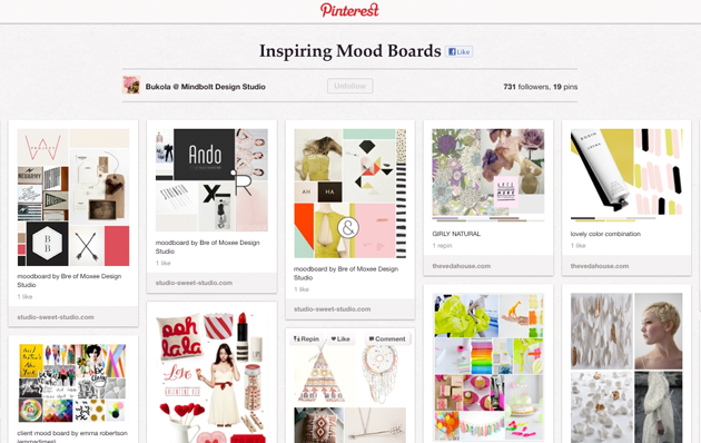
9. Lazy load
Lazy loading can be useful when you have a lot of information to display and want to reduce the interaction coast. Loading content while scrolling provides a more comfortable experience than clicking. Famous examples for this technique are the Facebook timeline and Pinterest.
4 things to consider when applying progressive disclosure
When you are planning to use progressive disclosure it is essential to consider user interfaces very carefully. For choosing the right pattern there are some things to consider:
1. Know your users
On the web it’s anybody’s guess who might be using the site. The website visitor might be a teen, programmer, or scientist. Learning styles, comfort levels and expectations differ greatly. Everybody is a special case somehow.
One thing all users have in common, they want simplicity. Users don’t have time to learn an overload of features, they only want to select the few that are optimal for their needs.
When using interactions in the correct way users don’t even notice they are using progressive disclosure. They are able to orient to an interface quickly, figure out what they need to do and move from A to B to fulfill their objective.
2. Prioritize content
It’s vital to get the right split between primary and secondary content. You have to decide everything the user needs up front so they can decide if they want to progress to the secondary content.
To properly prioritize we first need to identify the users goals. By mapping out the entire user flow we can understand what people need in every step of the journey. Only show information that is relevant to the task the user wants to focus on, on any given page.
Use traditional techniques like card sorting to get the grouping right, and invest time in user testing to ensure your design supports the real task performance, including both simple (or common) tasks and advanced tasks.
3. Avoid multiple levels progressive of disclosure
If you have so many features that you need 3 levels or more, reconsider your design. If you can’t scale back the complexity, at least chunk the features into groups that make sense.
4. Solve the problem of discoverability
When using progressive disclosure, you need to hide content while It must be clear how users progress from the primary to the secondary content. You can achieve this by
- Make the mechanics of the operation simple (clear buttons and indications of actions)
- Use clear labels on buttons to manage the expectations for what a user will find when they progress to the second level.
Using progressive disclosure in an effective way.
When we design new patterns for our plugins, we always try to get the most out of the interface. We try to maximize whatever space is available and progressive disclosure helps us with this task.
Progressive disclosure is a great solution to organize content in modern user interfaces. It keeps the interfaces clean and helps people deal with content complexity without confusion. Try to use it when needed but keep focus on the goal.
Resources
https://www.nngroup.com/articles/progressive-disclosure/
https://uxplanet.org/design-patterns-progressive-disclosure-for-mobile-apps-f41001a293ba
https://blog.prototypr.io/designing-for-progressive-disclosure-aabb5ddfbab4